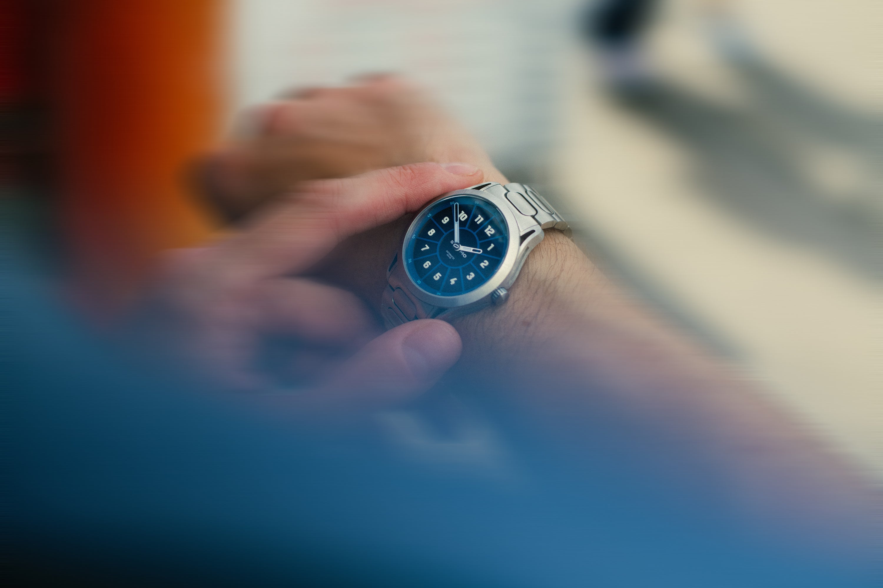
The Watch That Sells Slowness While Moving at Full Speed
The SLOMO Glance is a Toronto microbrand watch with an unusual dial. But the more interesting story is how Ben Moyle built a brand identity around a contradiction.

Quick answer:
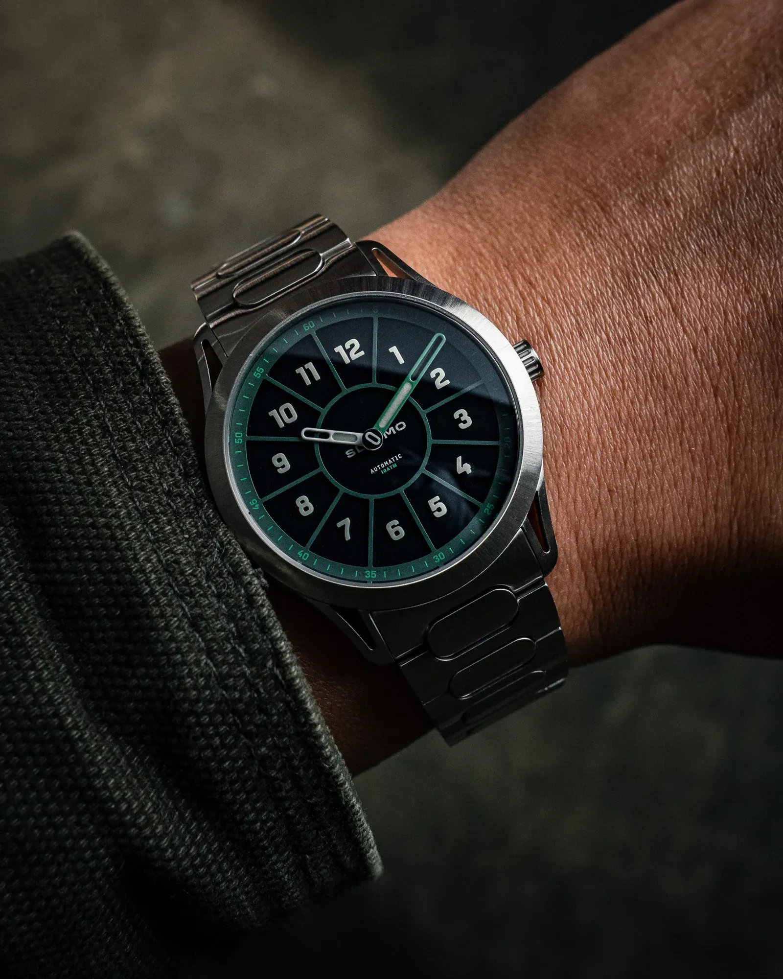
The SLOMO Glance is a 39mm automatic watch designed in Toronto by art director Ben Moyle. Its defining feature is an offset dial that repositions Arabic numerals inside each hour zone rather than at zone boundaries, paired with partially skeletonized hands and a rotating "O" logo in place of a traditional seconds hand. The result is a watch that reads faster than almost anything conventional, while philosophically arguing for slowing down.
The Insight Worth Paying Attention To
Most watch brands borrow identity. SLOMO built one from a contradiction, and that tension is the entire marketing engine.
Here is what separates SLOMO from the typical microbrand launch: the brand name is not a name. It is a directive. SLOMO carries a legible worldview before the product even enters the frame, and Ben Moyle, a career art director, understood that the dial needed to prove the philosophy rather than just illustrate it. The offset numerals do not just look different. They make time-reading measurably faster. The brand sells slowing down by building a watch that speeds up comprehension. That is a genuinely sophisticated positioning move, and most independent watch founders do not think at that level on their first release.
The Full Picture, Running Together

SLOMO Watches positions itself at the intersection of the slow-living counterculture and the microbrand collector market, reaching buyers who are skeptical of legacy watch marketing and drawn to objects with a coherent point of view. The target audience is not hunting for a status symbol. They want something that communicates an inner life. Moyle's storytelling leans on that instinct directly, framing the Glance as a philosophical instrument as much as a timekeeping tool. "When you shift the way you read time, it changes how you think about it," Moyle told The Calibrated Wrist, and that quote functions as the brand's thesis statement, not merely a founder anecdote.
The customer journey SLOMO is architecting moves from intellectual curiosity to emotional identification. You encounter the dial, find it strange, then find it obvious, and somewhere in that transition you stop thinking about it as a watch and start thinking about it as a perspective. The design language enforces this at every layer: the oblong "O" logo appears in the seconds disc, the bracelet center links, the crown engraving, and the case-side grooves, as documented across both the official product page and Mainspring Watch Magazine's hands-on review.

SLOMO
Nothing is decorative. Every detail is load-bearing for the concept. Where most microbrands pick up visual motifs from heritage brands and remix them, SLOMO invented its own visual grammar and then disciplined itself to speak nothing else. The differentiation is not "better than Swiss X at lower cost." It is closer to: this object has an argument, and you either agree with it or you do not.
The marketing pitch writes itself from there. SLOMO is not selling a watch to people who need one. The brand is selling membership in a particular way of thinking about time, to people who already believe the modern pace of life is a problem they want to resist. Worn & Wound noted that "the legibility it brings can't be argued with", which matters commercially because it removes the practical objection that unconventional dials usually generate.


SLOMO
The watch works. The philosophy holds. The design proves both. That is a rare alignment for a debut product from any brand, let alone one funded through Kickstarter by a first-time watchmaker operating out of Toronto.
What to Watch For Next
The open question is not whether SLOMO has a compelling product. It clearly does. The open question is whether the brand can hold this level of conceptual discipline as it scales, or whether the pressure to introduce new references, complications, and colorways will gradually dilute the singular logic that makes the Glance legible as a cultural statement. Plenty of microbrands launch with a clear point of view and then lose it chasing their second release. SLOMO's real test is not the Glance. It is whatever comes after it.