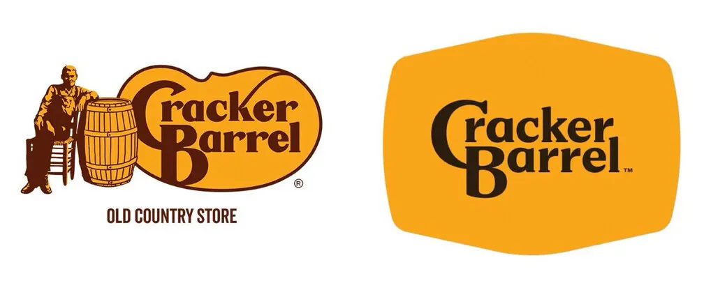
Politics aside, the Cracker Barrel Logo is just a bad logo.
You can swap logos, but you can’t out-rock a rocking chair. Cracker Barrel’s design flop is really a lesson in iconography, nostalgia, and missed transitions.
This post is for subscribers only
Sign up now
Already a member? Sign in

