
Great User Experiences Make Good Decisions Feel Effortless
Great UX design reduces cognitive load so decisions feel effortless. Learn how audience analysis, personas, information architecture, and usability testing work together.
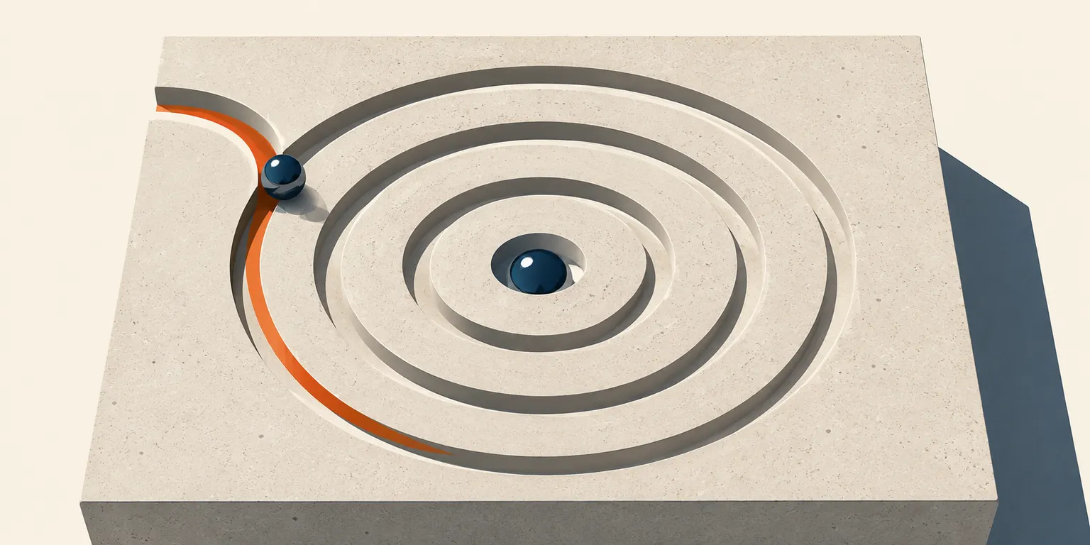
Most people think good user experience design is about making things look clean. Pleasing colors, consistent typography, a homepage that doesn't make you wince. And sure, visual design plays a role. But if that were the whole job, then hiring a decent graphic designer and calling it a day would be enough. It isn't. The real work of UX design is something stranger and more consequential: shaping the conditions under which people make decisions, without them noticing you're doing it at all.
That's the actual goal. Not beauty. Not simplicity for its own sake. The goal is reducing the distance between what a user wants to do and what they actually manage to do.
Key Takeaways
- Great UX design is fundamentally about reducing cognitive load, not just visual polish.
- Audience analysis and persona development are the research foundations of effective design, but only when they surface real behavior, not demographic assumptions.
- Information architecture determines whether users can find what they need without frustration; when it fails, no amount of visual refinement saves it.
- Interaction design creates the moment-to-moment texture of a user's experience through consistency, feedback, and accessibility.
- Usability testing, measured through task completion rates, error rates, time on task, and comprehension, converts design assumptions into actionable data.
- According to Forrester Research, every $1 invested in UX returns $100. The ROI is not ambiguous.
The Classic Idea: Design What Users Say They Want
Here's the founding myth of UX design, told in the most flattering version possible. You sit down with your users. You listen carefully. You build exactly what they describe. They love it. Everyone's happy.
This version of the story is seductive because it sounds democratic, even ethical. Put the user at the center. Let their needs drive every decision. It's called user-centered design (UCD), and it is, in broad strokes, correct. UCD places the user at the center of the design and development process, using empathy, iteration, and involvement to ensure the product actually fits the person using it.
The principles hold up. Empathy with users, involvement throughout the process, iteration based on real feedback, and a genuine commitment to accessibility and inclusivity are not optional add-ons. They are the foundation.
But the classic idea breaks down at a specific point: when designers take "user-centered" to mean "user-directed." There's a meaningful difference between centering users and simply executing their instructions.
Henry Ford's possibly apocryphal line about faster horses is overused, but it gestures at something real. Users are not design consultants. They can tell you where something hurts. They rarely know why, and they almost never know how to fix it.
Infotechnics · Decision design
Great user experiences make good decisions feel effortless.
The real product of design is not visual polish. It is a shorter distance between intention and outcome—built by removing the tiny uncertainties that make people hesitate, err, and disappear.
The decision-distance simulator
Small moments of friction accumulate.
Adjust the conditions beneath a simple task. The path changes as ambiguity, competing choices, unnecessary steps, and weak feedback reshape the distance between intention and completion.
The interface disappears. One obvious route, few decisions, and visible confirmation preserve the user’s momentum.
The silent majority
Bad experiences rarely explain themselves.
Satisfaction is a weak proxy for effectiveness. People can report feeling fine while failing the task—and most dissatisfied users never tell the team why.
Less likely to return
After a bad experience, the consequence is usually behavioral: the next visit never happens.
Actually complains
Feedback captures the vocal exception, not the full population absorbing friction in silence.
Run no usability tests
Nearly half of companies make experience decisions without systematic evidence that users can succeed.
One voice. Twenty-five exits.
The complaint is visible. The abandonment is not.
Evidence, not permission
Each research method sees a different failure.
Testing is not a ritual that grants permission to ship. It is a portfolio of lenses: depth explains why, scale shows where, and structural methods reveal how users expect information to be organized.
Task flow, spoken uncertainty, and precise moments of confusion.
Completion, error frequency, and drop-off across more users.
Which variation changes conversion or engagement at scale.
How users group and label information before structure hardens.
Scan patterns, hierarchy, and where visual attention actually lands.
The interaction layer
Four forces shape every moment.
They do not optimize independently. Good design manages their tensions while preserving the user’s sense of orientation and control.
Measure behavior
Ask whether the task worked.
Feelings add context. Outcomes reveal whether the experience actually carried intention through to completion.
The best interface leaves no memory of itself—only the feeling that the right thing was easy to do.
UX succeeds when research, structure, interaction, and measurement compress the distance between intention and outcome.What Everyone Gets Wrong About User Experience
The most common misunderstanding in UX practice is treating satisfaction as a proxy for effectiveness. A user might rate their experience positively while having failed to complete a key task. They might abandon a checkout flow, attribute it to not feeling like buying right now, and move on, never connecting the friction they felt to a design flaw they didn't consciously register.
This is the quiet crisis at the center of a lot of UX work. People don't always know when they've been failed by a design. They just leave.
According to research cited by UXCam, 88% of users are less likely to return after a bad user experience. But only 1 in 26 dissatisfied customers actually complains. The other 25 disappear. No feedback form filled out, no scathing review posted, no explanation given. The design absorbs their confusion like a sponge, and the team never finds out.
This is why audience analysis is not a box you check before moving to wireframes. It's ongoing interpretive work. The goal isn't demographic profiling. Knowing that your primary user is a 34-year-old marketing manager with a postgraduate degree tells you very little about how she navigates uncertainty when a menu label doesn't quite match what she's looking for.
Effective audience analysis uses surveys and questionnaires for quantitative signals, interviews and focus groups for qualitative depth, and analytics with heatmaps to observe actual behavior rather than reported behavior. Reported behavior and actual behavior diverge constantly, and the divergence is almost always the interesting part.
Persona development has the same problem when handled carelessly. A persona is meant to be a fictional character representing a real user segment, built from research data, capturing goals, behaviors, pain points, and motivations. What personas too often become is a collage of assumptions dressed up in a stock photo and a name. "Meet Sarah. She's 28, loves yoga, and shops on her phone during her commute." That tells a design team very little about how Sarah behaves when she can't find the return policy, or why she abandons a cart three-quarters of the way through checkout.
The persona is only as useful as the research underneath it. If the research is thin, the persona is fiction. And designing for fictional users produces fictional solutions.
What the Field Has Come to Understand
UX design has been moving steadily toward a more behavioral and structural understanding of what it means to serve a user well. The shift isn't dramatic enough to mark with a single moment, but the direction is clear: away from aesthetics as the primary measure of quality, and toward cognitive load as the thing that actually determines whether someone completes a task.
Cognitive load is the mental effort required to process information and make decisions. Every unnecessary step in a checkout flow adds cognitive load. Every ambiguous label in a navigation menu adds cognitive load. Every unexpected outcome following a user action adds cognitive load. The accumulation of these small loads is what separates a product that feels effortless from one that feels exhausting, often without the user being able to say exactly why.
Information architecture has become the discipline most directly responsible for managing this load. IA is concerned with how content is organized, labeled, and made navigable. Done well, it creates a hierarchy that reflects how users think, not how the organization thinks. Done poorly, it produces what researchers sometimes call "lost in the woods" syndrome, where users understand each individual page they land on but have no coherent sense of how the pieces fit together or where to go next.
The components of effective information architecture include sitemaps that reveal structural logic, navigation systems built around user expectations rather than internal categories, labeling systems that use language people actually recognize, and search functionality that provides multiple pathways to the same destination. Breadcrumbs, autocomplete, grouped content, and clear hierarchies are not decorative. They are orientation tools.
Interaction design sits one level closer to the surface, governing the moment-to-moment texture of how users engage with buttons, forms, sliders, menus, and feedback cues. Its four operating principles are simplicity (fewer steps), consistency (uniform patterns across the product), feedback (visible confirmation that actions have registered), and accessibility (usable by people with disabilities across a range of input methods). These principles interact with each other constantly. Adding a step to improve clarity might conflict with simplicity. Changing a familiar pattern to improve accessibility might undercut consistency. The work involves managing tradeoffs, not optimizing toward a single variable.
One thing the field has learned with some difficulty is that cross-platform consistency matters in ways that weren't always anticipated. A user who books something on a desktop and then checks the status on mobile is the same user, with the same expectations and the same memory. Inconsistent experiences across platforms produce confusion that gets attributed to the product, not to the mismatch between design decisions made in separate workstreams.
What That Means Operationally
Understanding these principles is one thing. Building the processes to act on them is another.
Audience Analysis That Actually Surfaces Behavior
The operational version of audience analysis starts with the recognition that you're looking for friction, not profiles. The question isn't "who is this person?" It's "where does this person get stuck, and why?"
Surveys capture scale. They tell you how many people encountered a problem. Interviews tell you what the problem actually felt like from the inside. Heatmaps and session recordings tell you what people did, regardless of what they said. A rigorous audience analysis draws on all three, because each method has blind spots the others compensate for.
Persona Development That Holds Up in the Room
A usable persona includes the elements that drive actual design decisions: what the user is trying to accomplish, what they've tried before and found lacking, what context they're operating in (distracted? time-pressured? on a small screen?), and what success looks like from their perspective.
Demographics provide context. They don't generate design decisions on their own. The moment a team starts debating a navigation choice by asking "what would Sarah do?" rather than "what does our research show users do in this context?", the persona has started doing harm rather than good.
Information Architecture Built Around Mental Models
The most effective IA work begins with card sorting. In card sorting exercises, users organize unlabeled content into categories that make sense to them, which often look very different from the categories that made sense to whoever built the site. The gap between those two categorization systems is where users get lost.
Tree testing (the inverse exercise, where users navigate a proposed structure to find specific content) reveals whether a proposed IA actually functions before it gets built. These are not glamorous methods. But they prevent the much more expensive problem of launching a structure that nobody can find their way through.
Usability Testing as Measurement, Not Validation
This is a place where a lot of organizations go wrong. Usability testing gets treated as a ritual that produces permission to ship. "We tested it. Users seemed fine." The value of usability testing isn't validation. It's measurement.
The metrics that matter are task completion rates (the percentage of users who successfully finish a specified task), error rates (how often users make mistakes and of what kind), time on task (how long it takes, which is a proxy for friction), comprehension (whether users correctly understood what the content was saying to them), and conversion rates (whether users completed the desired action).
User research · Evaluation methods
A testing method is only as useful as the question it can answer.
Different methods reveal behavior, scale patterns, compare alternatives, expose mental models, or track attention. None provides the complete picture alone.
| Testing Method | Best Used For | What It Measures | Key Limitation |
|---|---|---|---|
| Moderated Usability Testing | Deep behavioral insight | Task flow, verbal reasoning, confusion points | Time-intensive; small sample sizes |
| Unmoderated Usability Testing | Scale and speed | Completion rates, error frequency, drop-off points | Less context for unexpected behavior |
| A/B Testing | Comparing design variations | Conversion rates, engagement differences | Tells you what works, not why |
| Card Sorting | IA and navigation design | User mental models, content categorization logic | Doesn't test full navigation paths |
| Eye-Tracking Studies | Layout and visual hierarchy | Attention distribution, scan patterns | Expensive; lab conditions may skew results |
No single method is sufficient. Moderated testing generates insight but at small scale. A/B testing generates data at scale but tells you what happened, not why. Card sorting is indispensable for IA but won't catch interaction design problems. A testing program that combines methods covers more of the surface area of potential failure.
And 45% of companies, according to research from UXCam, conduct no form of usability testing at all. That figure deserves a moment. Nearly half of organizations are making design decisions without systematic evidence that those decisions serve users. They're building on assumption and hoping the assumption turns out to be right.
What Effective UX Design Is Actually Trying to Build
It helps to hold in mind what the goal actually is. Not a beautiful product. Not a product users say they like. The goal is a product where the right decision, for the user's actual purpose, requires the least possible effort to find and execute.
When a user lands on a page and immediately knows where to go, they haven't noticed your navigation design. When a form submission succeeds without confusion, they haven't praised your interaction design. When the content they were looking for appears where they expected to find it, they haven't complimented your information architecture.
They've just done the thing they came to do.
That invisibility is the point. Great UX design doesn't announce itself. It disappears into the background of the experience, leaving only the outcome. The decisions that felt hard become easy. The paths that seemed unclear become obvious. The product, at its best, reads the user's intention before they've fully articulated it, and gets out of the way.
The process that produces this involves real audience research, personas built on data rather than intuition, information architecture shaped by how users actually think, interaction design that communicates clearly at every touchpoint, and usability testing that measures outcomes rather than feelings.
None of that is simple. But the simplicity on the other end of the process, the experience that feels effortless, is exactly what the work is for.
Frequently Asked Questions
What is user experience design, and how is it different from visual or graphic design?
User experience (UX) design is the process of designing digital products, such as websites and mobile applications, with a focus on how users interact with them, including usability, accessibility, and the clarity of information. Visual or graphic design addresses how things look. UX design addresses how things work. A visually polished product can still fail at UX if users can't navigate it, can't find what they need, or consistently make errors during key tasks. The two disciplines overlap but solve different problems.
What is information architecture, and why does it matter more than most teams think?
Information architecture (IA) is the discipline of organizing and structuring content so users can find and understand information efficiently. Poor IA produces what researchers call "lost in the woods" syndrome, where users understand individual pages but have no sense of where they are in relation to what they want. IA matters more than most teams think because it operates beneath the visual layer, which means its failures are often invisible to the people who built the product. Users don't say "your information architecture is poor." They just leave.
What is persona development in UX design, and when does it go wrong?
Persona development is the practice of creating fictional characters representing key user segments, built from real audience research data. Personas capture user goals, behaviors, pain points, and motivations to help design teams make decisions with a shared understanding of who they're designing for. Persona development goes wrong when the underlying research is shallow, when demographic details substitute for behavioral insights, or when teams treat the persona as a user consultant rather than a research synthesis tool. A persona built on thin data produces decisions that serve a fictional user, not a real one.
What usability testing methods should teams prioritize?
The right testing method depends on the question being asked. Moderated usability testing provides deep qualitative insight but works at small scale and requires significant time. Unmoderated testing offers faster data collection across more users but provides less context for unexpected behavior. A/B testing compares design variations at scale but reveals outcomes, not causes. Card sorting is valuable for diagnosing information architecture problems before they get built. Most mature UX programs combine methods rather than relying on a single approach, because each method has blind spots that others compensate for.
How do you measure whether a UX design is working?
Measurement centers on behavioral outcomes, not satisfaction scores. The core metrics are task completion rates (the percentage of users who successfully finish specified tasks), error rates (how often users make mistakes and what kind), time on task (how long completion takes, as a proxy for friction), comprehension rates (whether users correctly understand what the product is communicating), and conversion rates (whether users complete desired actions). Heatmaps and click maps add behavioral layer by showing where users actually look and click, regardless of what they report. Qualitative feedback from interviews and open-ended usability testing supplements the quantitative signal.
What is the ROI of investing in UX design?
According to Forrester Research, every $1 invested in UX returns $100, representing a 9,900% ROI. Additionally, research indicates that boosting a UX development budget by 10% can lead to an 83% increase in conversions. These figures reflect the compounding effect of reducing friction across a product used at scale. Small improvements to task completion rates and conversion flows accumulate quickly when multiplied across large user bases.
What is user-centered design, and how does it differ from designing what users say they want?
User-centered design (UCD) is a design approach that places the user's needs, behaviors, and context at the center of every design decision. It involves empathy, iterative testing, and ongoing user involvement throughout the development process. It differs from simply executing user requests because users can accurately describe where they experience pain but rarely know the underlying cause or the best design solution. User-centered design uses research methods, including observation and behavioral testing, to move beneath self-reported preferences and find the actual source of friction.
An independent voice that will raise an eyebrow.
The Off Label is marketing strategy in action. We go further than what's on the surface. Every play, brief, strategy, and trend published here is proof of how we connect dots and turn ideas into an advantage.
Browse Full Foundations Archive →Published from the Charleston, South Carolina strategy lab. Synthesizing marketing behavior into actionable strategy for New York City and the world's creative hubs.
© 2026 The Off Label. All rights reserved. Content on this site may not be reproduced without prior permission.
NYC / LDN / CDMX / CHS

