
Elegance Is Usually Edited In
Elegance isn't a first-draft talent. Learn why great design, copy, and strategy come from ruthless editing, and how reduction becomes a competitive advantage.

Quick answer: Elegance is not a first-draft talent. It is what remains after a creator removes everything that doesn't earn its place. The most refined design, copy, and strategy come from a destructive editing process, not a single moment of inspiration. If your work looks effortless, somebody worked very hard to make it look that way.
There's a story people tell about the legendary art director sketching one perfect line on a cocktail napkin. The brand identity, fully formed, between drinks. It's a great story. It's also mostly a lie.
What actually happened sits in a recycling bin somewhere. A hundred versions of that line, each slightly wrong, each thrown out. The napkin sketch was real, but it arrived at the end of a long argument the audience never saw. We remember the napkin because the napkin is flattering. The recycling bin is where the actual work lives, and nobody photographs the recycling bin.
This matters because the napkin myth makes people prize the wrong skill. It tells you that elegance is a gift you either have or don't. The truth is more useful and more annoying: elegance is a process, and the process is mostly deletion.
Why your first draft is supposed to be bad
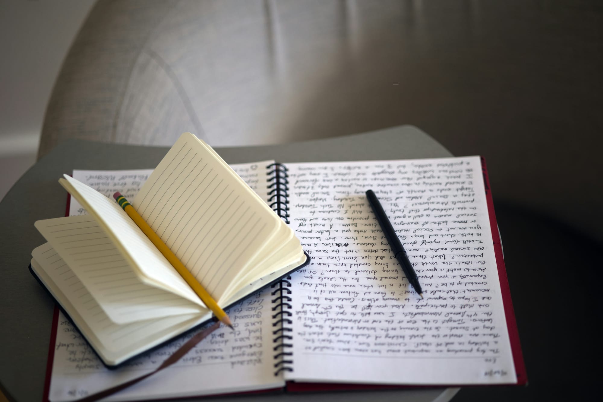
Every strategy deck, every layout, every piece of ad copy starts out bloated. This is not a flaw. It's the system working correctly.
The first pass is bloated because the creator is still figuring out what they actually mean. You write five sentences to discover the one you needed. You design six variations to find the proportions that feel right. The excess is not waste. It's the cost of thinking on the page. People who try to skip this step, who reach for clean and minimal on the first attempt, usually produce something thin instead of something refined. There's a difference between a sentence that has been cut down and a sentence that was never fully grown.
So the bloat earns its keep. The problem is what happens next.
Most creative work dies in the gap between the first draft and the brave one. The generative mind that produced all that material is reluctant to destroy it. You spent three hours on that paragraph. The transition is genuinely hard, because you have to switch from a mind that loves making things to a mind willing to break them.
Creative maturity is mostly this second mind. The willingness to look at a phrase you're proud of and ask whether the work needs it, or whether you just enjoy looking at it. Those are different questions, and the answer to the second one is almost always the same.
Carving versus piling
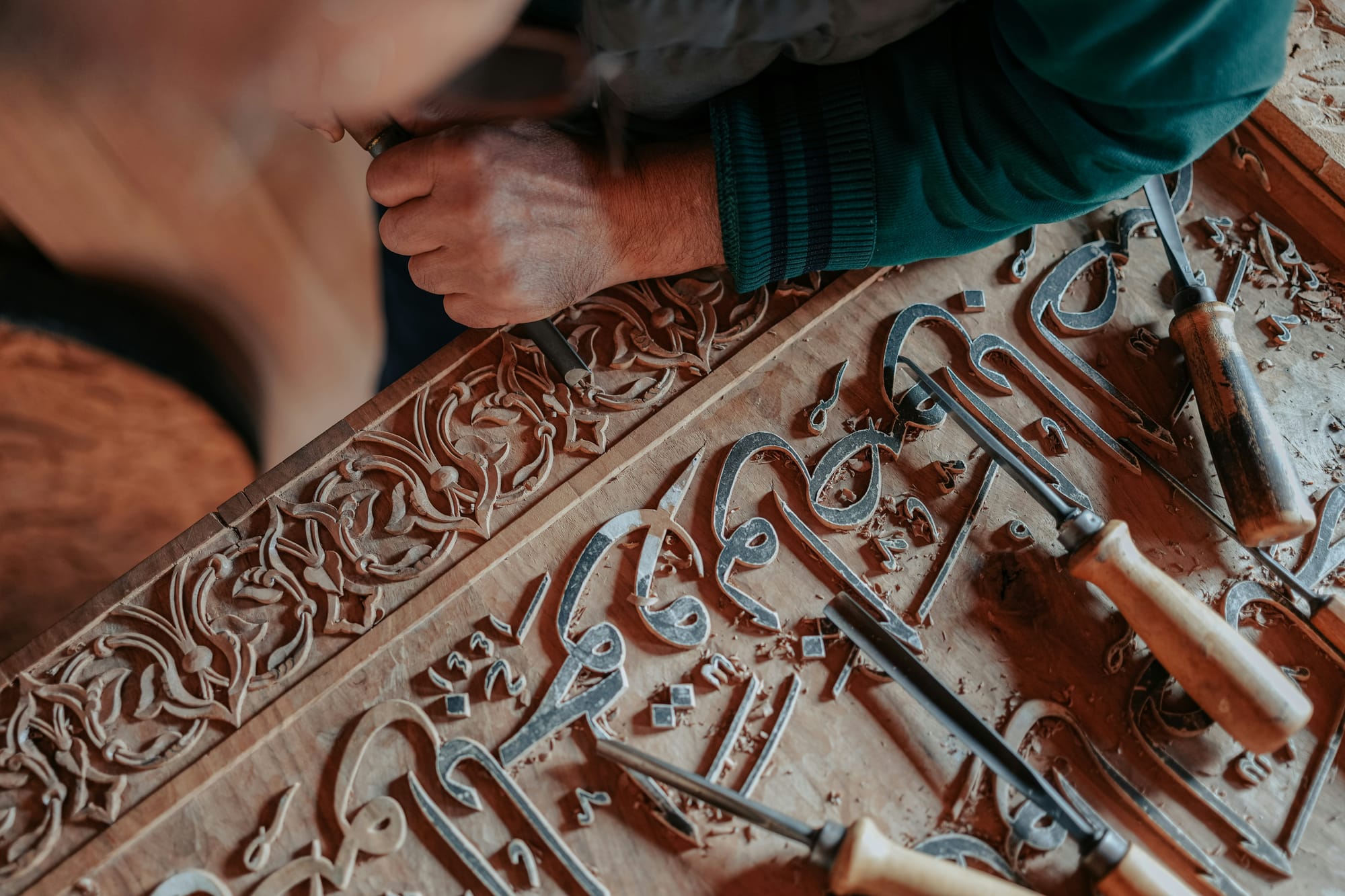
There are two ways to make something big.
You can pile rocks. You add and add, and the thing grows by accumulation, and at the end you have a mound that is technically large and impresses no one. Or you can carve. You start with a block and you cut away everything that isn't the shape you're after.
The pile gets bigger as you work. The carving gets smaller, and somehow more itself. Most creative processes default to piling because piling feels like progress. You can measure it. The deck went from twelve slides to twenty-five, so something must be happening. Carving feels like loss, even when the loss is the entire point.
A reasonable counterargument: not everything should be carved. Some work genuinely needs more, not less. A barren landing page that withholds the one fact the customer came for isn't elegant, it's just unfinished pretending to be confident. Reduction is a tool, not a religion. The skill is knowing which mode the work is in, and that judgment is harder than either adding or subtracting on instinct.
But on balance, the industry has a piling problem far more than a carving problem. Almost nobody gets fired for adding a slide.
What reduction actually looks like

Three places it shows up, in plain operational terms.
Whitespace is doing work. The empty space around an object is not absence. It's the thing that lets the eye find the object at all. Cram a layout edge to edge and you've technically used every pixel while communicating nothing, because the viewer has no idea where to look. Space directs attention. A page with one clear focal point and a lot of room around it reads as confident. A page with eleven competing elements reads as anxious. The viewer feels the difference before they can name it.
Verbal economy beats adjective stacking. Corporate writing has a tic where it reaches for five soft adjectives instead of one hard noun. "A truly innovative, best-in-class, next-generation solution" tells you nothing. The adjectives are doing the job a precise noun should do, and doing it worse. One sharp word that's exactly right will change the temperature of a room. A string of qualifiers just lowers the reader's blood pressure until they leave.
Pacing respects time. Most presentations include the predictable opening that everyone has seen a thousand times. The agenda slide. The throat-clearing. The slow ramp to a point that could have opened the deck. A well-edited presentation cuts the runway and starts near the tension. It trusts the audience to catch up, and audiences almost always can. Boredom in a room is usually a pacing failure, not an attention failure.
These aren't aesthetic preferences. They're decisions about where you spend the audience's finite attention. Every element you keep is a withdrawal from that account. Spend it on what matters.
The part where editing hurts

Here is the uncomfortable mechanic underneath all of this. The work feels most painful to cut precisely when the cutting matters most.
You will be most attached to the clever bits. The line that shows you're smart. The flourish that proves you can do the hard version. Those are exactly the parts that usually need to go, because they serve the maker's ego rather than the audience's understanding. You have to love the work enough to kill the parts that are only there to be admired.
I am not above this, for the record. I have written sentences so pleased with themselves that they actively obstructed the point, and I have fought to keep them, and I have lost those fights and the writing got better every time. The pattern is humiliating and consistent.
So a working rule: if your strategy looks complicated, you're not done. Complexity is often a sign that the thinking hasn't finished. The real idea is usually simpler than the first version of it, and getting to that simpler version requires more effort than the elaborate version did, not less. Keep editing until it hurts a little. The pain is the signal that you've reached the part worth protecting.
Brevity is a strategy, not a style
The shortest path to high utility is almost never the first path you find. It's the one left over after you cut the others.
Treating elegance as a luxury misunderstands what it does. A refined brand strategy isn't refined because it's pretty. It's refined because it removed every choice that would have diluted the one decision that mattered. Clarity is a competitive position. When everyone else is piling on features and qualifiers and slides, the work that has been carved down to its actual point stands out by contrast, and it costs nothing to ship except the discipline it took to get there.
If you want people to remember the idea, stop burying it in choices. Find the one thing the work is really about, protect it, and delete the rest with more conviction than feels comfortable. The napkin sketch was never the gift. The willingness to throw away the ninety-nine drafts before it was.

