Swatch Neon Seppia: Retro Maximalism Returns
Swatch’s Neon Seppia watch, inspired by the 1994 Aquachrono, targets young buyers, nostalgic collectors, and design-conscious consumers, emphasizing style and nostalgia over precision. It embodies Swatch’s playful brand identity, appealing to those who value fun and color in watchmaking.
The Setup
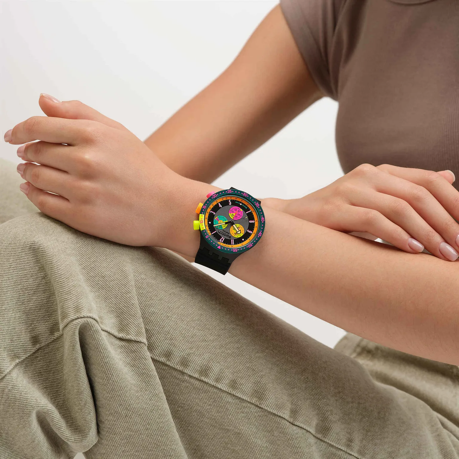
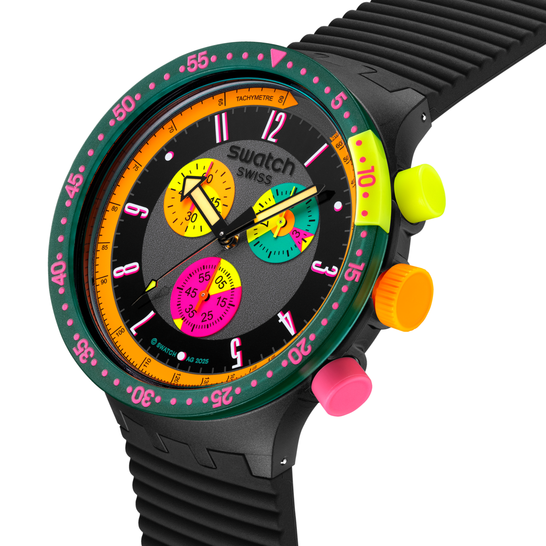
The Neon Seppia takes a 1994 Aquachrono and turns the volume all the way up. A 47mm oversized chronograph with fluorescent subdials, glow-in-the-dark hands, and a strap built for the dance floor. It is less about discreet timekeeping and more about wearing a 90s club flyer on your wrist.
This is Swatch reminding everyone that fun, color, and chaos are as much a part of watchmaking as steel and heritage. At $165, it is not competing with Omega or Rolex. It is competing with boredom.
The Breakdown
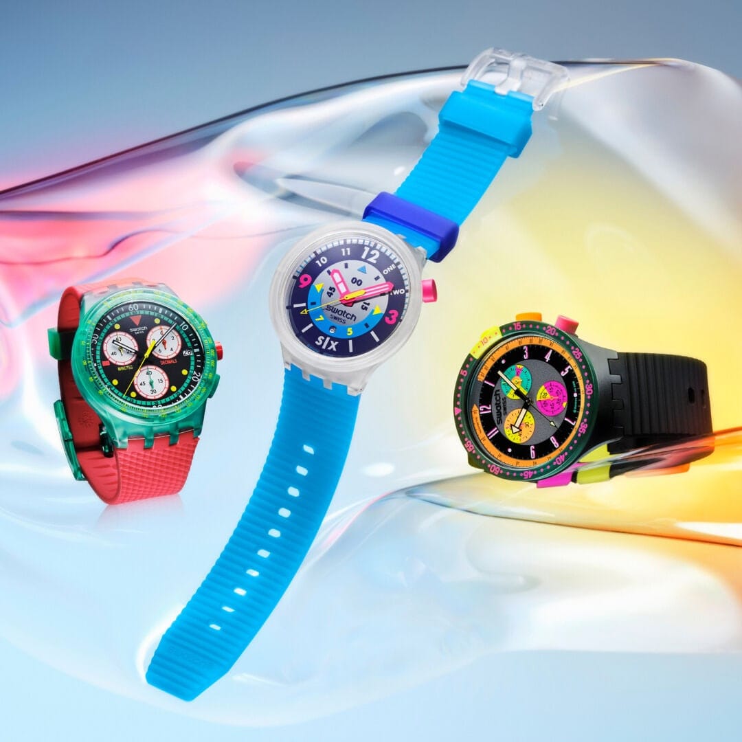
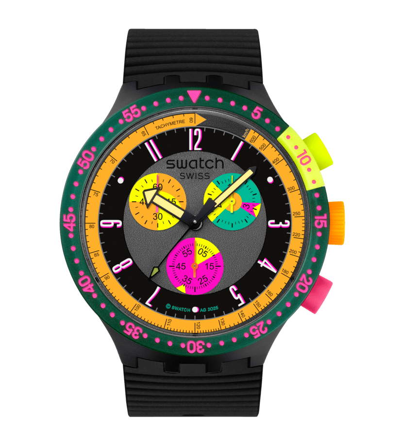
The Neon Seppia is part of the Swatch NEON Collection | Swatch
Brand Positioning and Identity
Swatch positions itself as the playful disruptor of Swiss watchmaking. The Neon Seppia is a continuation of that DNA, anchoring the brand as accessible, irreverent, and culturally plugged-in. It’s not about precision timing as a luxury flex, it’s about style, personality, and nostalgia.
Target Segment and Audience
Young buyers who want a bold, affordable statement piece and older collectors nostalgic for the Swatch boom years of the 80s and 90s. It’s also aimed at design-conscious consumers who treat Swatch as wearable pop art.
Messaging and Storytelling
The story leans on archive revival. Swatch digs into its past (the 1994 Aquachrono Seppia) and reimagines it with bigger proportions, louder neon palettes, and a fresh retro-future vibe. The messaging is: “Remember when watches were fun? That feeling is back, and bigger.”
Experience and Journey
The customer journey is less about utility and more about vibe. It’s impulse-purchase friendly at $165, positioned as an instant wardrobe statement rather than a serious timekeeping investment. From store displays to online drops, the journey is designed to trigger nostalgia and delight, ending with the watch becoming a conversation piece on the wrist.
Community and Culture Insight
Swatch knows its role in pop culture. These are not heirloom watches. They’re artifacts of play and collective memory. The Neon Seppia connects to rave culture, festival wear, streetwear, and even the arcade aesthetic. It taps into the nostalgia economy where 80s and 90s kids now have disposable income.
Differentiation and USP
Other watch brands cannot get away with this mix of color and kitsch while still being taken seriously. Swatch’s USP is being the one Swiss brand that trades in joy and mass accessibility. Limited heritage revivals like this let them turn affordability into a collectible culture play.
Design Language
Oversized 47mm case, bold neon subdials, glow-in-the-dark hands, and color-blocked pushers make the Seppia scream retro. The choice of materials (polymer case, silicone strap) and the exaggerated proportions are as much fashion accessory as watch. This is design that wants to be seen.
Marketing Pitch
Swatch Neon Seppia is not just a timepiece, it’s nostalgia turned wearable. It’s a 90s club flyer on your wrist, reissued with modern build and bright enough to light up a festival tent. For $165, you’re not buying a watch. You’re buying the feeling of when design was playful, colorful, and fun.
Is It A Winning Pitch?
Would you actually wear it as a statement piece, or does it belong more in the display case of nostalgia?


