Seiko 5 Sports × Bamford: Precision Meets Imagination
Seiko and Bamford Watch Department collaborated on a limited edition of 2,025 watches. The collaboration emphasizes escapism and nostalgia, positioning the watch as a collectible piece that combines functionality with artistic expression.
The Setup
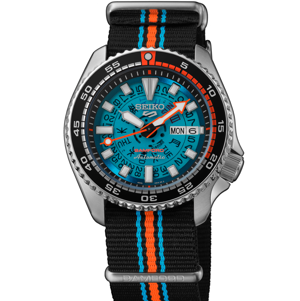
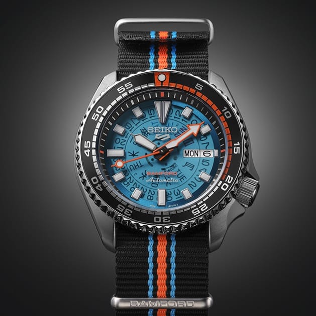
Seiko joined forces with Bamford Watch Department for a limited run of 2,025 watches that feel more like an escape than a collaboration. The translucent blue skeleton dial and neon accents look straight out of an ’80s sci-fi film, but underneath sits Seiko’s workhorse 4R36 automatic movement.
This is a watch built on duality. Engineering meets art direction. Heritage meets retro futurism. Even the launch film turns the Seiko dial into a portal from office life to paradise.
Both brands trade in credibility but speak different dialects of cool. Seiko brings the legacy. Bamford brings the imagination. Together they prove that design evolution does not need to choose between reliability and wonder.
The Breakdown
Seiko × Bamford
Brand Positioning and Identity
The Seiko × Bamford collaboration positions itself at the crossroads of precision engineering and creative imagination. It fuses Seiko’s reputation for reliability and value with Bamford’s London-based flair for reinterpretation. The watch becomes a retro-futurist escape hatch rather than a technical instrument. Both brands share a belief in craftsmanship but differ in tone: Seiko speaks to consistency; Bamford speaks to curiosity. The partnership reframes Seiko’s accessible sports line as a collector’s canvas for artistic expression.
Target Segment and Audience
The target audience includes modern collectors, creative professionals, and design enthusiasts who appreciate both function and fantasy. They are typically 25–45 years old, globally minded, and interested in the cultural meaning of products rather than pure performance. This collaboration appeals to those who grew up on Japanese pop culture, anime aesthetics, and retro tech—people who see mechanical watches not as tools but as emotional artifacts.
Messaging and Storytelling
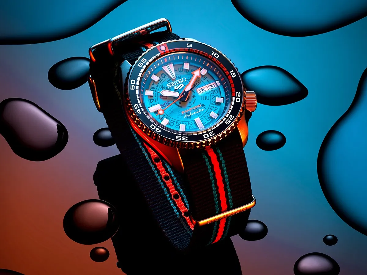
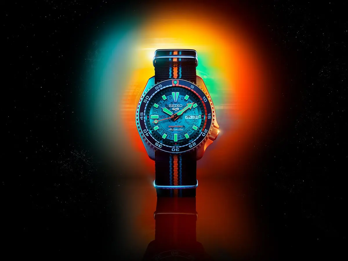
The storytelling centers on escapism. The anime short accompanying the launch visualizes the watch as a portal from corporate monotony to paradise. This aligns with Bamford’s philosophy of transforming everyday objects into imaginative experiences. The message is that owning the watch allows you to carry a small piece of freedom on your wrist. Seiko’s legacy provides credibility, while Bamford injects playfulness and color into that discipline. The story blends nostalgia, wonder, and a touch of surreal optimism.
Experience and Journey
The journey begins with discovery through vivid imagery and narrative. The customer is first drawn in by the color and transparency of the dial, then by the deeper symbolism of “journey to paradise.” Each feature supports that sense of transition: the neon glow, the see-through mechanics, the tropical blue palette. From unboxing to wear, the experience is designed to feel cinematic—more like entering a world than purchasing a product.
Seiko × Bamford
Community and Culture Insight
The collaboration taps into the global community of collectors who bridge vintage culture, streetwear, and design. It also connects with the creative-tech generation that sees Japan as the original source of cool. This audience enjoys irony, remix culture, and limited releases that feel personal but not elitist. The anime element recognizes how storytelling mediums now influence brand collaborations as much as design itself.
Differentiation and Unique Selling Point
The watch stands out through its retro-futurist tone and cultural narrative. While many Seiko releases emphasize heritage or endurance, this one celebrates imagination. It uses color and translucency to create visual depth that echoes both underwater exploration and neon nightlife. Bamford’s touch makes it collectible without inflating the price or losing Seiko’s democratic identity. The balance of affordability and conceptual art is what separates this edition from other collaborations.
Design Language
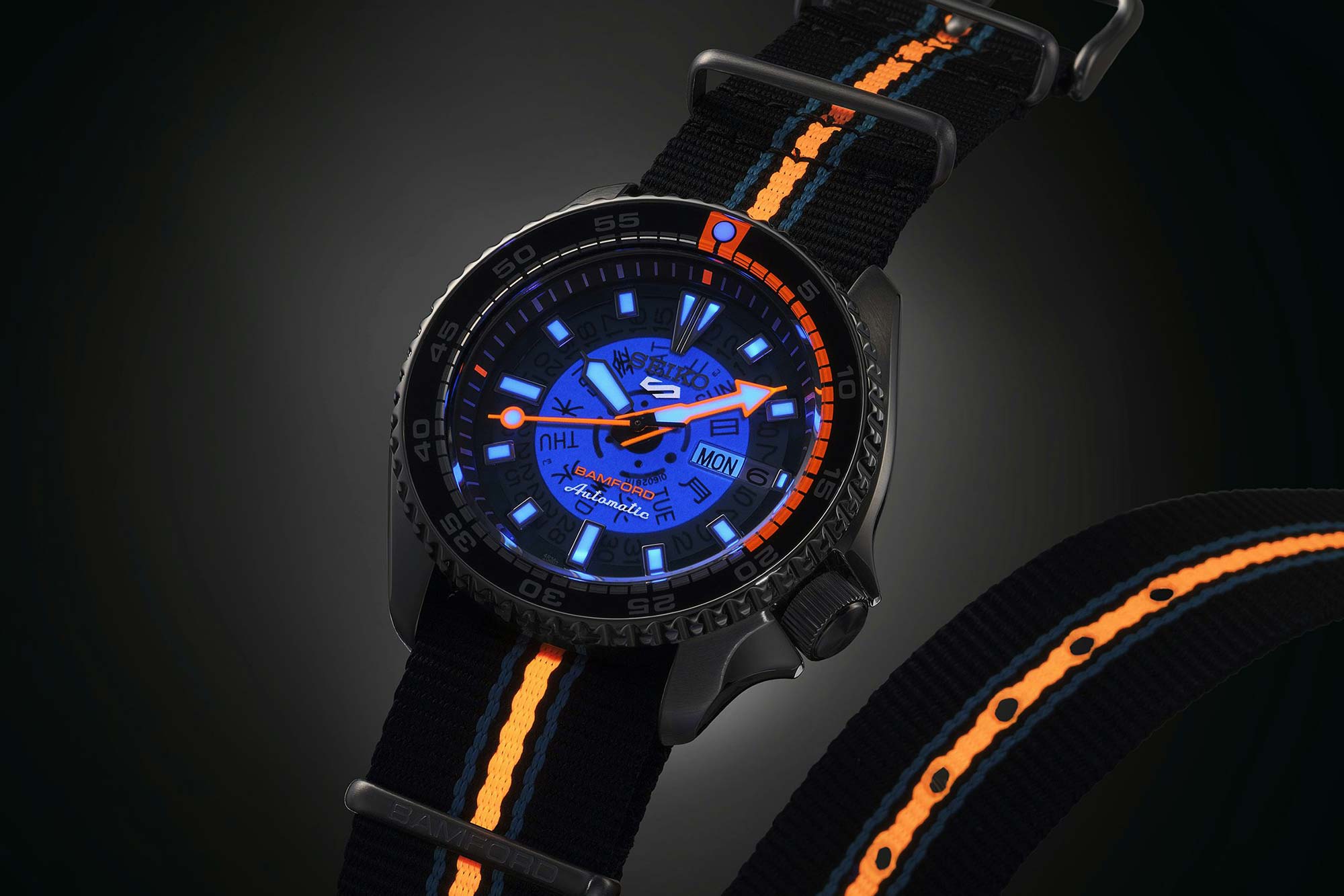
The translucent blue skeleton dial, neon accents, and 1980s index design combine nostalgia and novelty. Fluorescent tones echo both dive-watch utility and Tokyo nightlife. Typography and logo placement are minimal, letting the color and geometry carry the message. The packaging pays homage to 1960s Seiko boxes but reinterpreted with Bamford branding, reinforcing the theme of travel between eras. Every design decision tells the same story: mechanical precision filtered through imagination.
Marketing Pitch
The Seiko 5 Sports × Bamford Limited Edition transforms precision into imagination. Inspired by a journey to paradise, it blends Japanese engineering with British creativity in a 1980s-infused vision of escape. The translucent blue dial reveals the mechanism within, the neon accents glow with energy, and every detail reminds you that adventure can begin with a glance at your wrist.
Is It A Winning Pitch?
Does all 2,025 watches being sold out convince you that this was a winning marketing pitch?