Quick Impressions: Week of December 22nd
Quick Impressions is our fast take series on products that catch the eye and spark an idea. No deep dives, just sharp looks and smart insights into what makes them stand out.
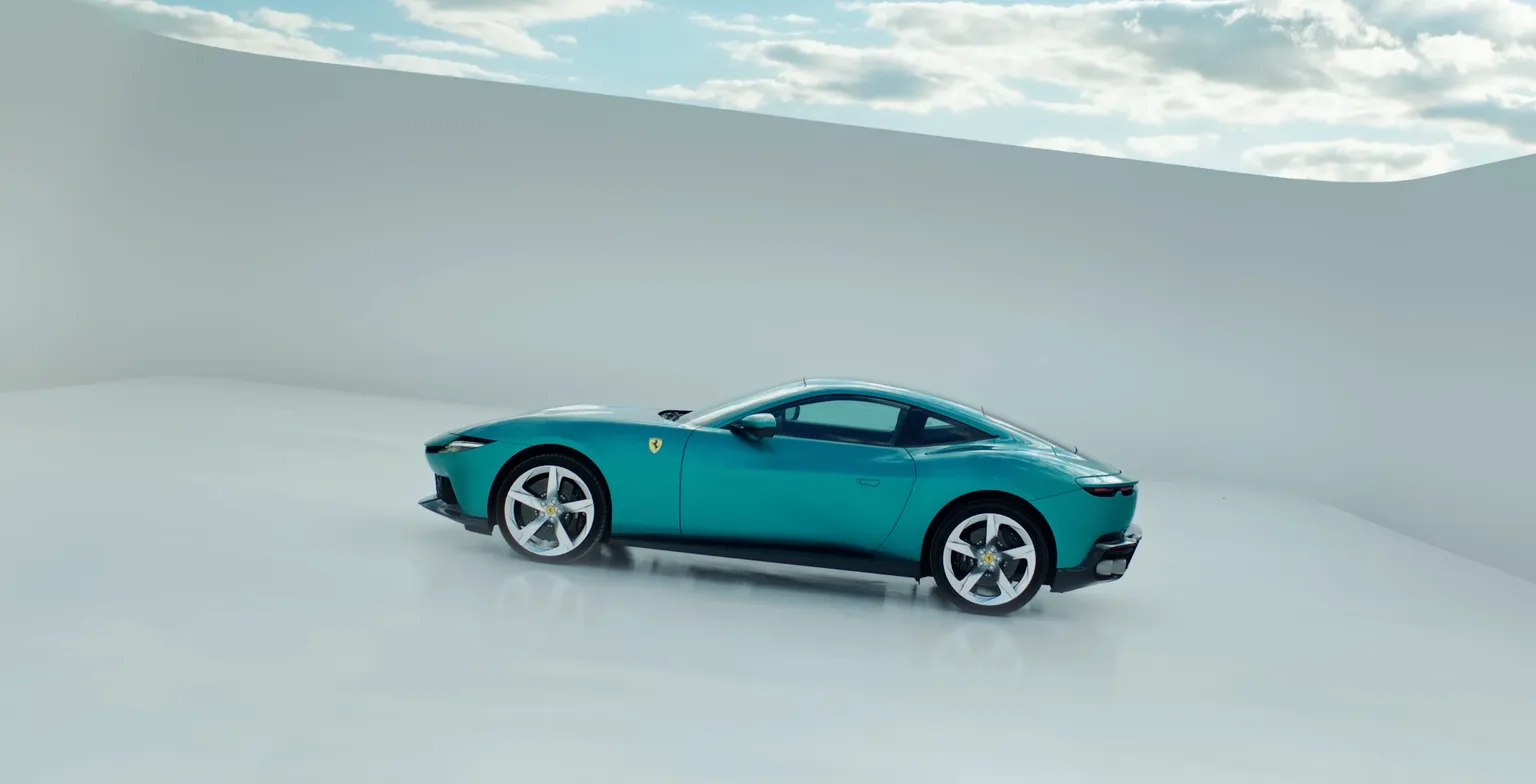
It Doesn’t Ask Much. Just That You Drive It.
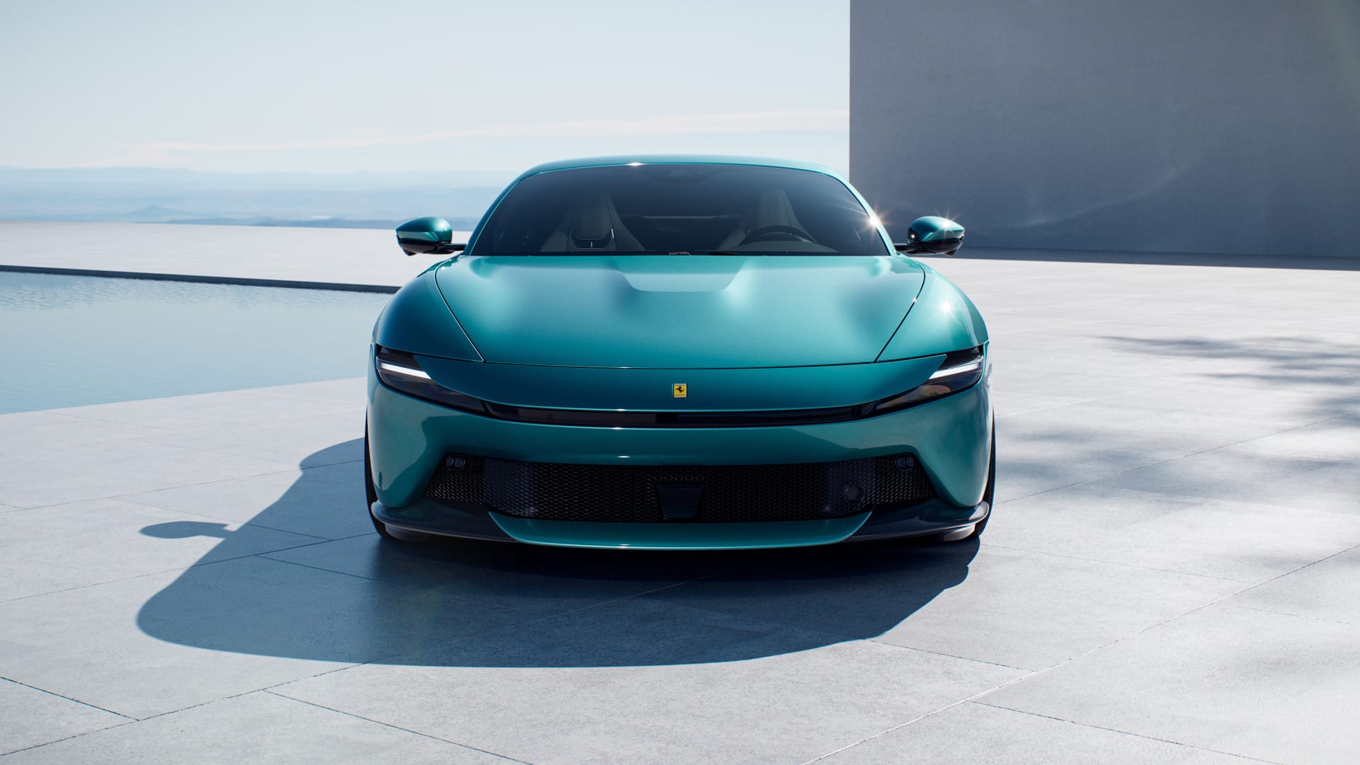
Ferrari’s Amalfi is a less extreme way to get more people into one.
Ferrari’s Amalfi introduces a new front-engine grand tourer positioned as an accessible entry point into the brand. With a V8 under the hood and a 2+ layout, it blends performance with a calmer, more livable configuration than Ferrari’s mid-engine flagships. The car was unveiled on the Amalfi Coast, pairing the product with a setting that reinforces elegance, travel, and ease rather than raw aggression. The result is a Ferrari designed to feel just as natural on a long coastal drive as it does pulling up to dinner.
What matters here is how Ferrari frames the invitation. The Amalfi is positioned as a first Ferrari that feels approachable. The launch, the setting, and the design language all lower the barrier to entry without lowering the brand. Ferrari emphasizes continuity over extremes. The Amalfi reads as a natural step into the Ferrari world without feeling like a compromise or a consolation prize. By focusing on approachability, atmosphere, and confidence, the car invites buyers to see themselves inside the brand.
When a brand leads with belonging instead of performance, does that make the product more desirable or more diluted?

It Will Hold Your Attention Longer Than It Should
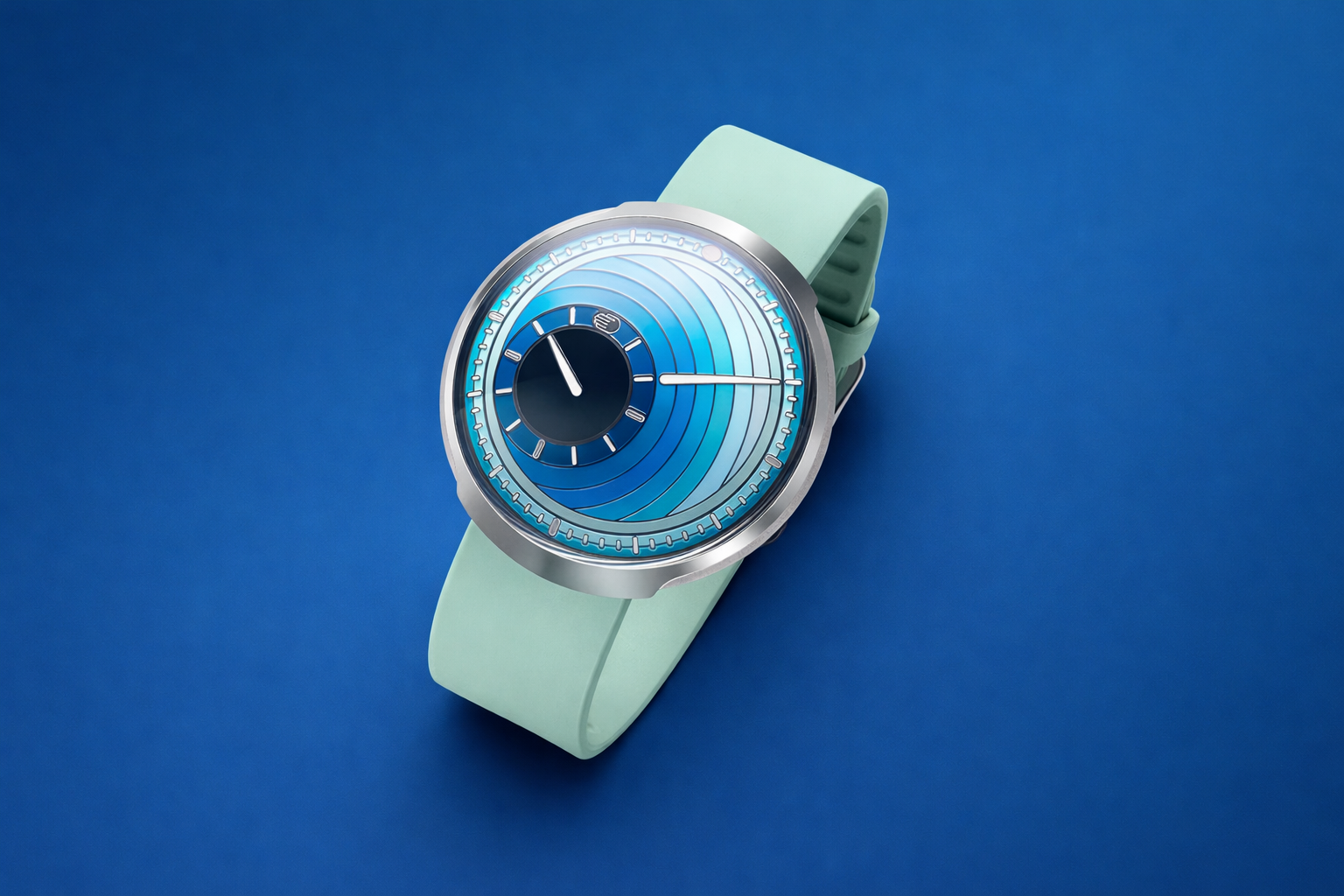
The Ressence Type 8 Daniel Engelberg is a watch designed to be read slowly, almost hypnotically.
The Ressence Type 8 Daniel Engelberg edition strips the mechanical watch down to weight, motion, and color. At just 42 grams in titanium, the case disappears on the wrist, leaving the dial to do the work. The collaboration with German artist Daniel Engelberg turns the Type 8’s already minimal layout into something more expressive, using color and movement to make time feel fluid rather than segmented. Production is limited to 40 pieces per colorway.
Ressence’s real move is choosing design thinking as its primary brand asset in a category dominated by history. The brand approaches horology from the user outward, deciding how time should be read before engineering how it is built. The ROCS system is not presented as a technical flex but as a different way of relating to time, one that feels immediate, graphic, and contemporary. Details like the absence of a crown, the rotating case back, and the seamless dial surface reinforce a single idea across the product and the story. Ressence positions itself as mechanical watchmaking for people who value clarity over ceremony. In doing so, it sidesteps the arms race of heritage and complication and claims a quieter territory: relevance.
If a product category has looked the same for decades, what changes when a brand treats it like an interface instead of a tradition?
Designed Once. Never Needs an Update.
Artemide’s Sintesi is smarter than most smart lamps because it left a good idea alone.
Artemide’s Sintesi task lamp first appeared in 1975, designed by Ernesto Gismondi before Artemide became synonymous with Italian lighting. A single hinge, a Y-shaped frame, and four primary colors defined its logic. Fifty years later, the reissued Sintesi still feels current because it was never chasing novelty in the first place. It folds flat for shipping, works with a standard E27 bulb, and turns adjustment into a simple mechanical action. In a category crowded with apps and updates, it’s a reminder that durability and clarity age better than features.
The Sintesi’s relevance today comes from how Artemide positions it. The form is unchanged because it doesn’t need correcting. Flat-pack efficiency, repairable components, and a neutral bulb standard align neatly with growing resistance to disposable objects. Even the color palette feels confident rather than retro. Artemide is presenting the Sintesi as proof that timeless design does not require reinvention. The lamp competes by still working exactly as intended, decades later.
If something designed in the 1970s still holds up, what does that say about how much progress we actually need?

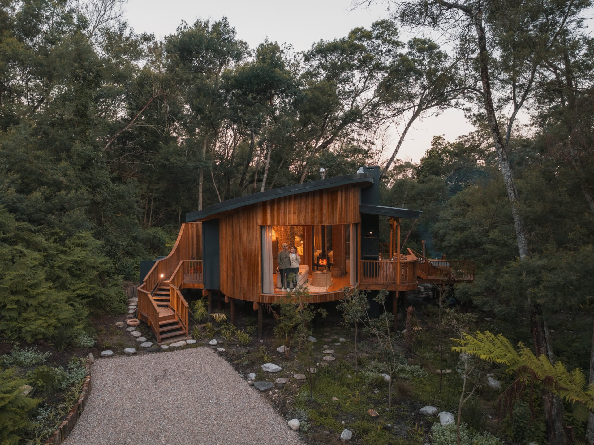
Sometimes You Want the Forest to Do All the Talking
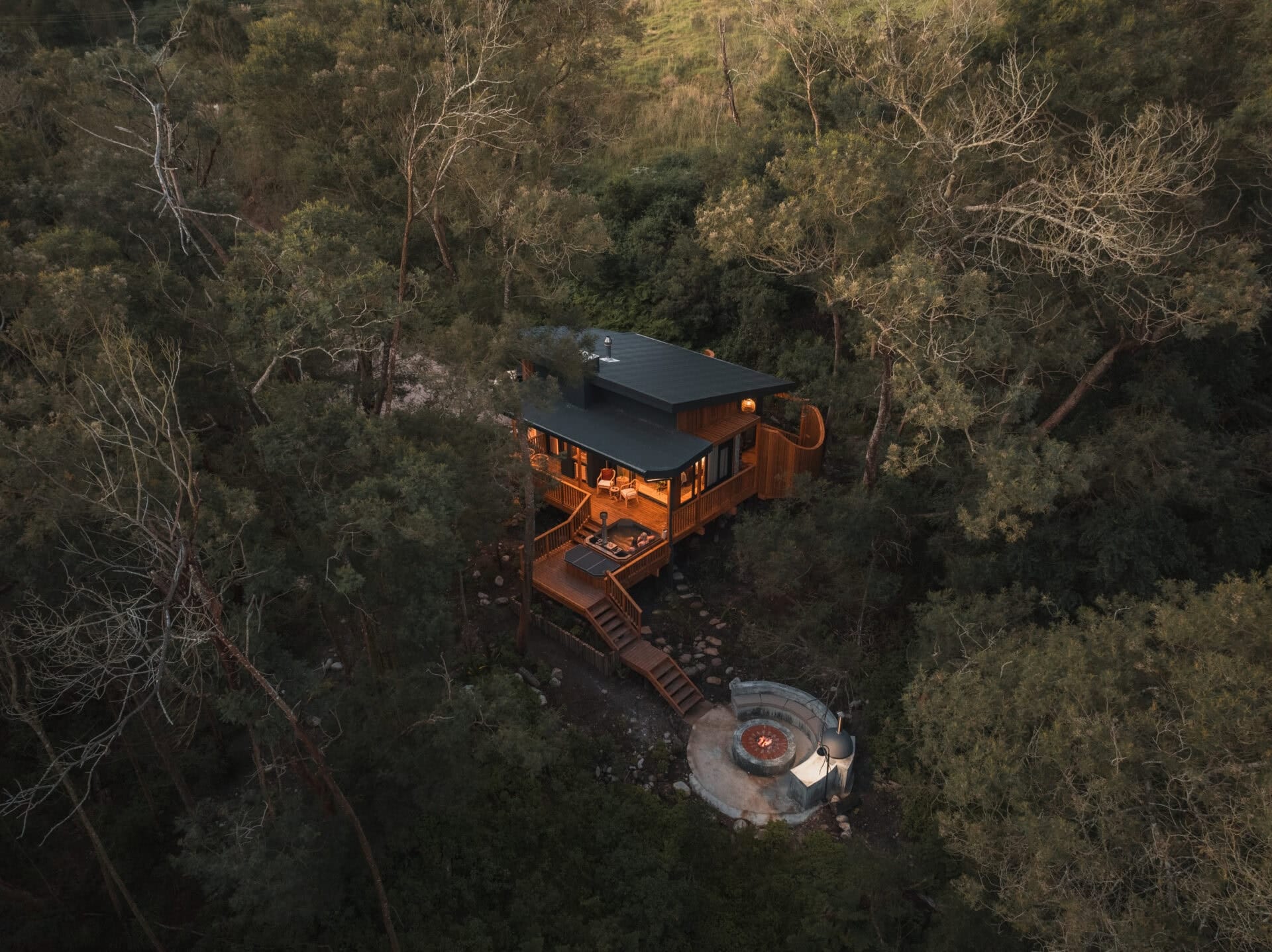
Boomhuis Cabin widens your attention span by narrowing your world.
Boomhuis Cabin sits deep in an indigenous forest at the base of the Outeniqua Mountains along South Africa’s Garden Route. It’s a one-bedroom retreat designed for two, wrapped in trees, light, and quiet. Inside, the space is compact but considered: a fireplace dividing living and sleeping areas, red velvet dining chairs, and a kitchenette stocked with small comforts like farm-fresh eggs and homemade piquante peppers. Outside, the experience opens up. A wood-fired hot tub, fire pit, pizza oven, braai, and double outdoor shower turn the clearing around the cabin into a series of places to linger. Town is close enough to reach easily, but far enough to forget.
Boomhuis positions escape through focus. Every element nudges guests toward slowing down without announcing it. The off-grid setup, limited footprint, and inward-looking layout keep attention on the setting rather than on amenities as features. The hot tub, outdoor shower, and fire become anchors for time spent outside instead of add-ons to photograph. Even the small gestures, like stocking ingredients rather than room service, reinforce mindful participation over passivity. The cabin works because it removes friction without removing effort, letting nature stay present while comfort stays quiet.
When a stay is designed to narrow your world instead of expanding it, does that make the escape feel deeper?