Monument Extended: Brutalism You Can Set in Type
Monument Extended is a typeface inspired by Brutalist architecture, offering a typographic system from ultra-condensed to wide-format. It targets designers, agencies, and brands seeking a commanding and unmistakable visual voice, particularly in branding, editorial, and digital design.
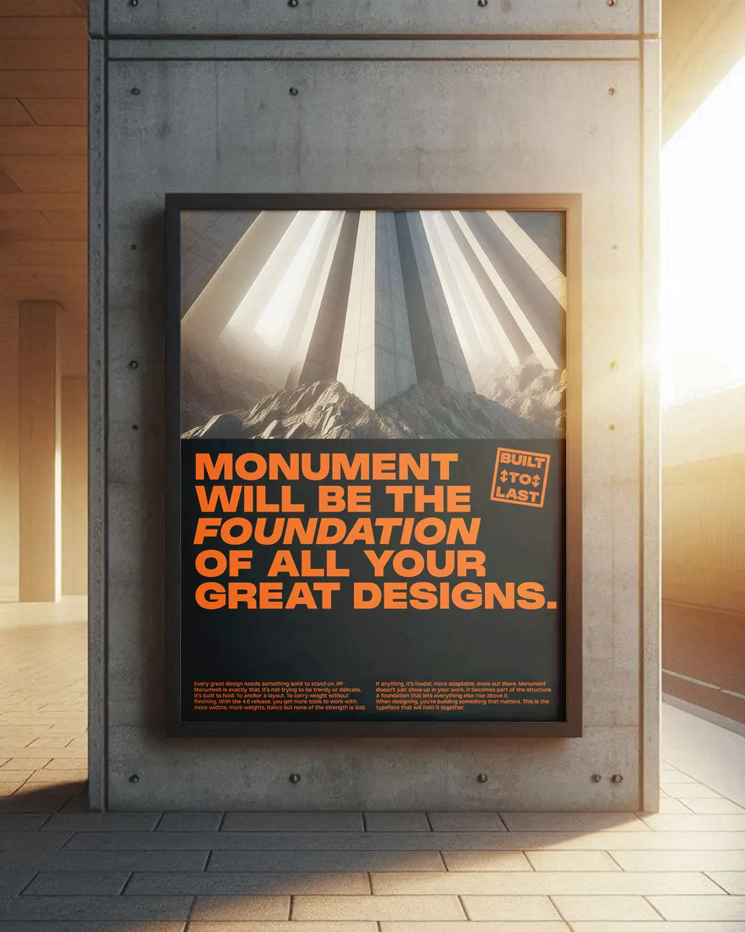
The Setup
Pangram Pangram’s Monument Extended is font reenvisioned as an architectural system. Inspired by Brutalist geometry, it scales from ultra-condensed to wide-format, giving designers a full typographic toolkit that feels less like a typeface and more like a framework.
What it really sells is confidence. Structural clarity. The kind of presence you’d expect from a building, not a wordmark. It’s why I’d pick it if I were building an agency inspired by Wieden+Kennedy. It carries the same mix of boldness and restraint.
The Breakdown
Pangram Pangram
Brand Positioning & Identity
Pangram Pangram positions Monument Extended not as just another font, but as a typographic architecture system. It claims space in the market by tying itself to the weight and permanence of Brutalism.
Target Segment & Audience
Designers, agencies, and brands that want their visual voice to feel commanding and unmistakable. Particularly those in branding, editorial, and digital who need type that flexes across platforms while holding authority.
Messaging & Storytelling
The story frames Monument Extended as “more than type.” It sells the idea that typography can behave like a building, offering structure, clarity, and presence. That narrative appeals to creatives who want their work to project confidence.
Experience & Journey
It guides designers from narrow, punchy headlines to wide, expressive spreads without ever leaving the same font family. The journey is flexibility without compromise, giving users the feeling of operating within a unified system.
Community & Culture Insight
Design culture often borrows from architecture and urbanism for metaphors of structure and permanence. Monument taps into that lineage and the current appetite for Brutalist aesthetics in digital and brand design.
Differentiation & USP
Where many typefaces cover a range of weights, Monument Extended covers both weights and widths, from ultra-condensed to extra-wide. This scale makes it more like a full system than a static font.
Design Language
Geometric rigor, heavy strokes, and disciplined proportions embody Brutalist cues. The expanded range of widths feels like structural spans and beams, reinforcing the architectural metaphor in every letterform.
The Marketing Pitch
Monument Extended is not just a typeface, it is a framework for confident design. It lets brands speak with the authority of architecture, whether whispering in tight lines or shouting across wide spreads.
Is It A Winning Pitch?
Would you use Brutalism as your brand’s voice, or does it feel too heavy for the everyday?

