Lay’s: From Snack Food to Soil Story
Lay’s, the world’s largest potato chip brand, is undergoing its largest redesign in nearly a century. The new campaign, “From Potato to Chip,” emphasizes the brand’s agricultural roots and the authenticity of its ingredients.
The Setup
The world’s biggest potato chip brand has launched its largest redesign in nearly 100 years, shifting the narrative from flavor and fun to authenticity and origin. The new campaign, From Potato to Chip, centers on something 42% of consumers didn’t even realize: Lay’s are made from real, farm-grown potatoes.
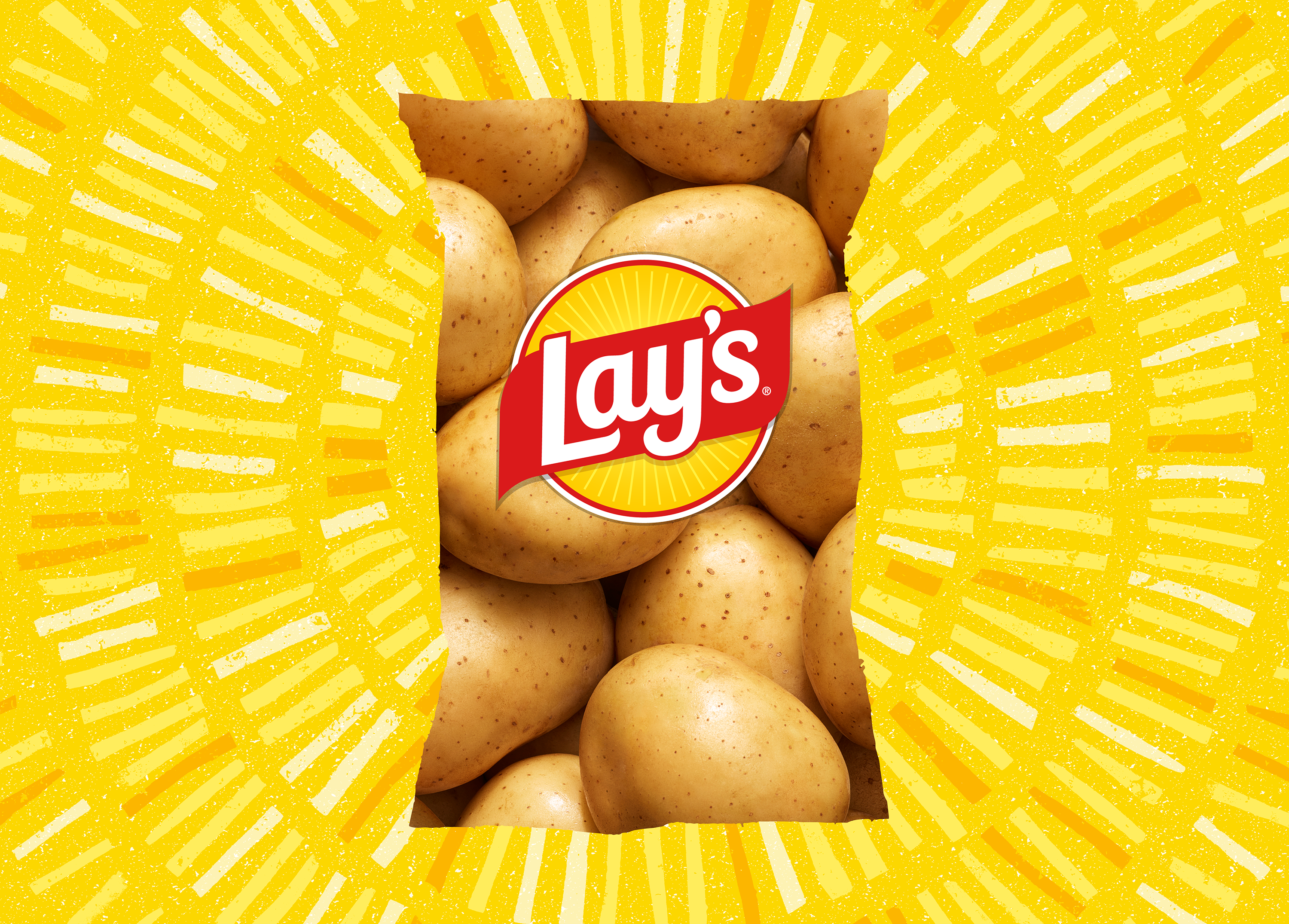
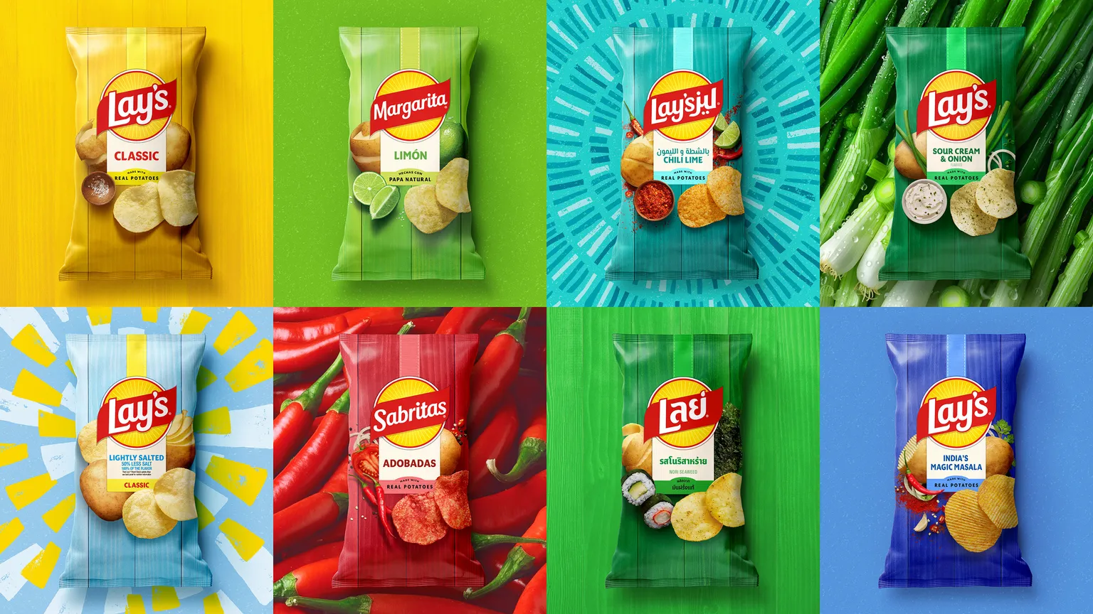
The refresh reframes Lay’s as an agricultural brand hiding in plain sight. Only ten potato varieties make the cut, each cultivated for nearly a decade before earning a place in the bag. The new identity brings that process forward: a warmer sun logo, earthy colors, ingredient photography, and packaging that feels closer to the farm than the factory.
This is mass-market transparency. Lay’s is doing what premium and craft food brands have done for years, telling the truth about where the product comes from and turning scale into storytelling.
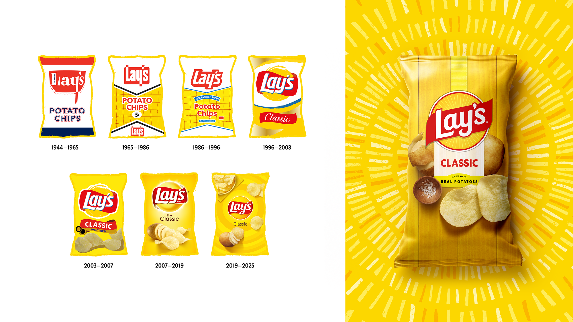
Lay's is heritage brand showing it can still evolve by taking it back to where it started: the soil.
The Breakdown
Brand Positioning and Identity
Lay’s is repositioning itself from a global snack brand to a symbol of real food with real roots. The new positioning blends heritage storytelling with modern transparency, framing Lay’s as both a household name and a brand rediscovering its agricultural identity. The essence is: joy that begins in the soil. The brand identity now centers on provenance, authenticity, and craft within mass production.
Target Segment and Audience
Lay’s is speaking to two overlapping audiences:
- Mainstream consumers who grew up with Lay’s but have shifted toward brands that signal “better ingredients” and authenticity.
- Younger, health-conscious shoppers who prefer brands that demonstrate origin and purpose, not just flavor and fun.
This update keeps legacy customers while courting a generation raised on Whole Foods cues and DTC storytelling.
Messaging and Storytelling
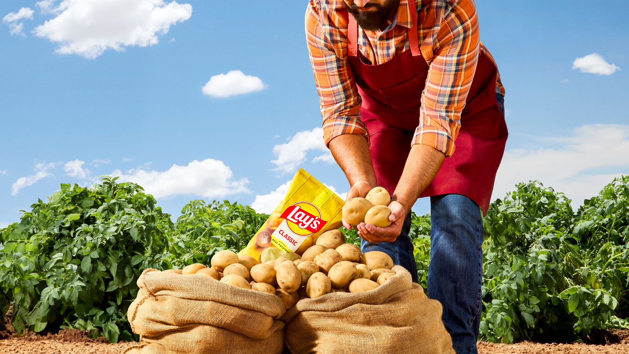
The narrative is a return to origin. Lay’s is turning the simple potato into its hero. The story highlights that only ten of over 4,000 potato varieties are “Lay’s potatoes,” taking up to nine years to perfect. This transforms industrial agriculture into a story of care and selection.
The messaging centers on transparency and pride in process. By revealing the farm-to-bag journey, Lay’s reframes what “quality” means for mass-market food: not exclusivity, but intimacy with the everyday.
Experience and Journey
Lay’s is guiding customers from ignorance to appreciation. The journey begins with awareness (“42% don’t know Lay’s are real potatoes”) and ends with emotional recognition (“every chip has a farmer behind it”).
Through packaging, advertising, and ingredient reformulation, the brand takes consumers on a sensory and ethical path from the farm field to the grocery shelf. The experience is meant to rebuild trust and pride in an everyday product.
Community and Culture Insight
Lay’s is responding to a cultural craving for truth in the ordinary. After decades of “fun and flavor,” consumers now value transparency, sustainability, and ingredient storytelling. Challenger brands like Kettle and Cape Cod have used authenticity as a differentiator. Lay’s is reclaiming that territory by showing that scale and sincerity can coexist.
It also acknowledges a cultural fatigue with fake ingredients, fake marketing, and fake narratives, and offers something grounded: real potatoes, real people, real joy.
Differentiation and Unique Selling Point
The differentiator is authenticity at scale. Most legacy snack brands talk about flavor; Lay’s is talking about agriculture. The unique selling point isn’t a new flavor or format, it’s the revelation that Lay’s has always been real food. This moves the conversation from taste to trust and repositions the brand to compete on values, not just variety.
Design Language
The redesign by PepsiCo Design & Innovation and its collaborators uses visual warmth, clarity, and natural texture as signals of honesty.
- The sun behind the logo becomes literal sunlight, a symbol of origin and life.
- The palette borrows from earth tones and natural pigments such as pickle green, hickory brown, and savory red.
- The photography shifts from playful abstractions to ingredient intimacy, with close-ups of chips that feel like produce.
- The packaging balances modern cleanliness with rustic cues, creating an aesthetic crossover between grocery and farm stand.
Typography and color unify a global system while allowing local flavors to remain distinct. The tone feels like heritage evolving, not heritage retreating.
Marketing Pitch
Lay’s is not just redesigning a bag of chips, it is redesigning what a legacy food brand can mean. The pitch is simple:
Lay’s is real food, made by real people, and rooted in real joy.
It’s a strategic shift from fun to foundation, reminding the world that the best-selling chip still begins in the dirt, not the lab.
Is It A Winning Pitch?
Does this move feel like legacy brand authenticity, or a smart micro-pivot repositioning strategy?