Coca-Cola × Converse Chuck 70: Vintage Optimism, Bottled in Leather
Converse and Coca-Cola collaborate on a Chuck 70 sneaker, drawing inspiration from mid-century nostalgia with a red, white, and glass-green color palette. The shoe features subtle design elements like ribbon lines and writable details, emphasizing personalization and emotional branding.
The Setup
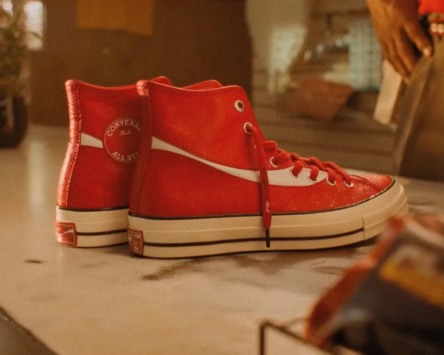
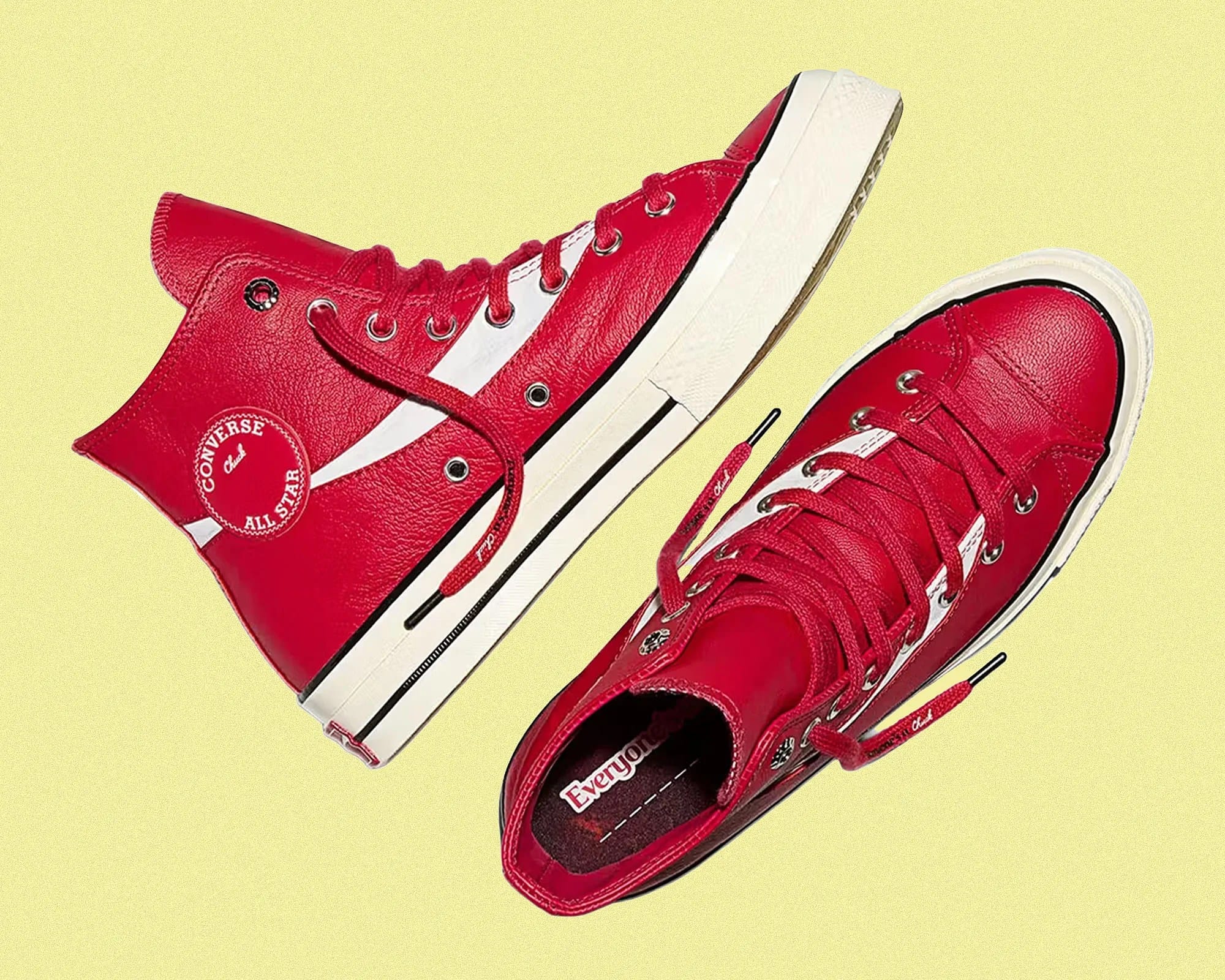
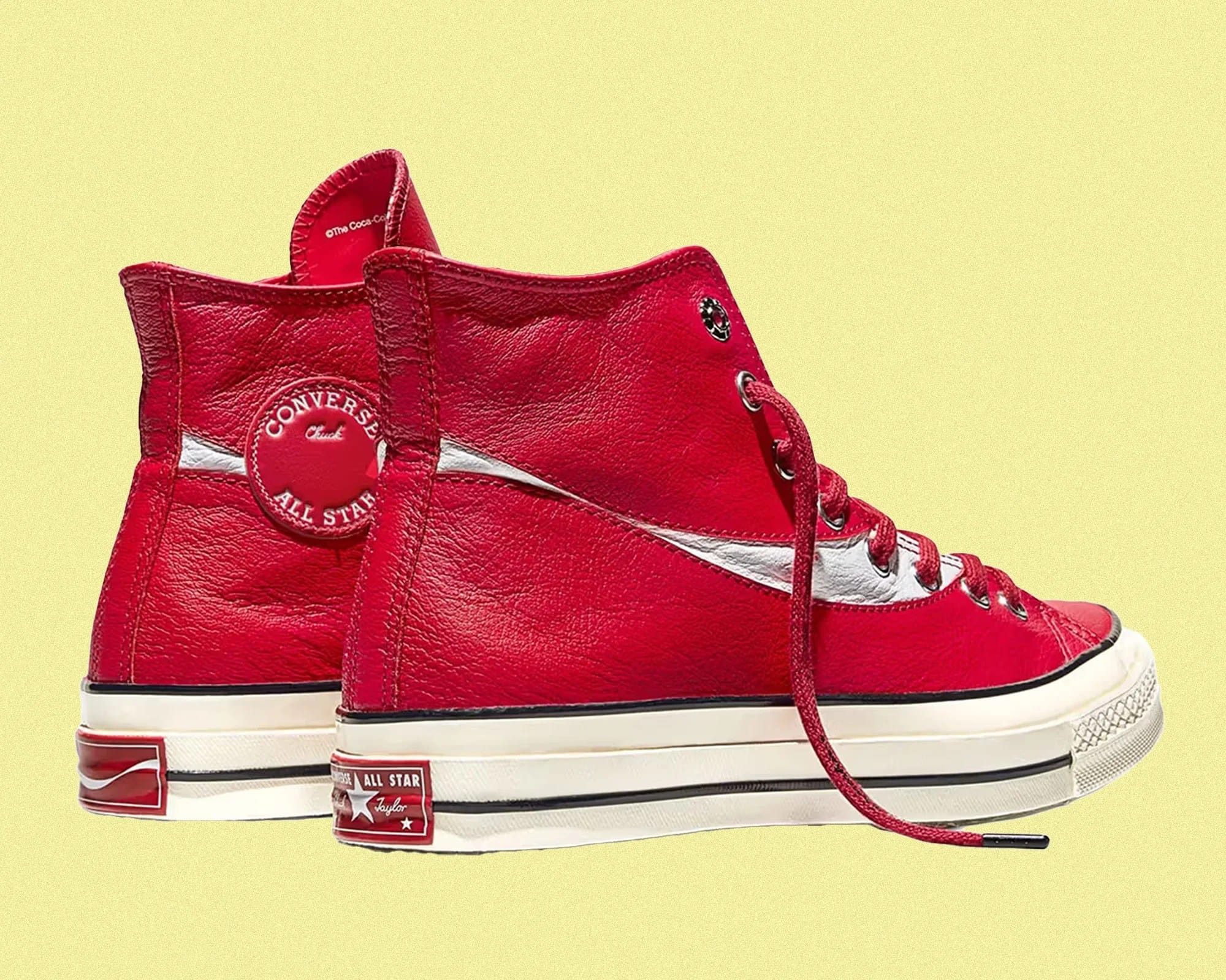
Converse and Coca-Cola revisit the Chuck 70 with a palette pulled from mid-century nostalgia: red, white, and the soft green tint of a glass Coke bottle. Subtle ribbon lines echo the curve of the can, while writable details on the tongue and insole turn a mass-produced sneaker into something personal.
This is emotional branding disguised as product design. Coke once reshaped Santa Claus to embody joy. Now that same visual language shows up on a sneaker, reminding buyers that authenticity can be designed, not declared.
Cultural longevity comes from familiar symbols treated with care. When brands remix their own heritage instead of chasing trends, nostalgia becomes a design system and memory becomes the medium.
The Breakdown
Converse
Brand Positioning and Identity
This collaboration frames itself as heritage reimagined. Converse and Coca-Cola link two pieces of American iconography into one nostalgic object. The shoe is not sold as a limited drop but as a cultural artifact that merges craftsmanship with memory. Its tone feels warm and familiar, echoing mid-century optimism through color and material: red, white, glass-green, and handwritten script. It celebrates design legacies that built the visual vocabulary of American style.
Target Segment and Audience
The audience is design-minded buyers who care about story, provenance, and craft more than hype. Most are late-20s to 40s, people who grew up with both brands as part of everyday culture. They collect meaning as much as objects. Globally, the collaboration appeals to fans of Americana who view these symbols as shorthand for creativity and freedom.
Messaging and Storytelling
The story equates the sneaker to a time capsule of American joy.
By linking the Coke-red palette to Santa Claus’s mythology, the narrative establishes Coca-Cola as a visual author of collective nostalgia. The copy and visuals lean into “heritage, connection, and personalization,” echoing Coke’s Share a Coke campaign and Converse’s personalizable DIY spirit.
Both brands converge around one message: familiar icons made fresh through subtle reinterpretation.
Experience and Journey
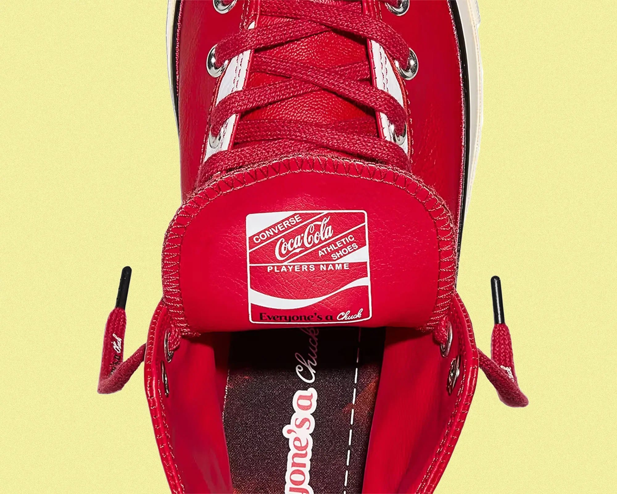
The experience is about rediscovery. From the press release to the product photography, customers are guided to view this as an artifact revived — something both collectible and wearable. The tactile details (leather upper, writable tongue tag, bottle-green outsole) create small “aha” moments that reward inspection.
Online, the story flows from recognition → nostalgia → discovery → personalization. The journey is less about buying sneakers and more about owning a cultural fragment that can age with you.
Converse
Community and Culture Insight
This collaboration taps into the ongoing culture of vintage Americana and emotional branding, where aging, patina, and analog aesthetics represent authenticity. The sneaker world has moved beyond technical performance, and cultural cachet now lives in texture, story, and meaning. The Converse × Coca-Cola release speaks to a community that values craft over hype and memory over novelty. It aligns with the post-hype mindset, where buying becomes a form of identity curation rather than collection.
Differentiation and Unique Selling Point
The collaboration’s distinction lies in American classicism. Earlier Coke × Converse releases were bold, logo-heavy partnerships with Kith. This version moves in the opposite direction, focusing on subtle details, tactile storytelling, and minimal branding. The writable insole and tongue patch turn mass branding into a personal ritual, a quiet twist on customization that fits the current heritage remix trend.
Design Language
Visually, it’s a masterclass in semiotic fusion.
- Color: Coca-Cola red and glass-green = instant brand recall.
- Material: Leather instead of canvas = nostalgic elevation.
- Graphics: The curved Coke stripe mimics packaging flow; bottle-cap logos nod to collectible ephemera.
- Typography: Classic scripts and minimal wordmarks keep it recognizable without feeling corporate.Together, these design choices translate packaging design into fashion design — a literal embodiment of product storytelling.
Marketing Pitch
Two icons of American optimism meet again, not to chase hype but to remind us why simple symbols endure. The Coca-Cola × Converse Chuck 70 reimagines classic red and white through heritage and personal story. Built in leather, detailed like a vintage bottle, and finished with a space to make it your own, it is not just nostalgia you wear. It is history made personal.
Is It A Winning Pitch?
Would you call this just another collab, or a lesson in how American icons keep their story alive?

